Logo

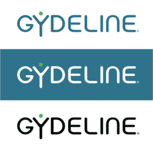
The Gydeline logo reflects the simplicity and clarity that are at the core of our company values.

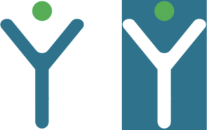
It contains a couple of simple elements. The text or ‘wordmark’ is based around the Plymdale font. The trademarked ‘Y Mark’ logo reflects our open and inclusive nature.

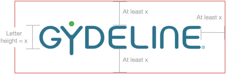
Closely following these logo guidelines will ensure a consistent brand identity. These guidelines and artwork should not be altered.

Logo Elements

Gydeline Logo Elements

Y Mark

This representation of a person with their arms outstretched forms the basis of several logo derivations. The basis for the shape is the underlying font letter ‘Y’.

The Y Mark element can be used in isolation:

Gydemark Logo

Colourways

Both the main logo and Y Mark have several colour variants. These colours should not be changed. In the majority of cases the Gydeline Blue and White colours will suffice. Variants are supplied for rare situations where the standard will not fit the given situation. More guidance on use of colour is provided in the Brand Guidelines section.
Gydeline Logo Colourways
Gydeline Y Mark Colourways

Free Space

Each logo should be used with clear space around the outside. This will ensure the Gydeline brand image does not become contaminated. An exclusion zone for each logo type is as follows:
Gydeline Logo Free Space

Alignment

In the majority of cases logos should be placed in the upper left corner of documentation & presentation materials. It should be the primary design element at the top of any page. Headers or other graphics that detract from this should not be used.

When used as a main or heading logo left alignment should be used. Centred or right alignment should only be used where the logo is used on the body of a document or is subservient to another logo/brand.

Incorrect Use

Do not:
  • Change the spacing between elements or characters within the logo
  • Change the colour of any element of the logo
  • Rearrange any of the logo elements
  • Place the logo at any angle
  • Change the aspect ratio of the logo

Variants

The rectangular version referred to above is the preferred choice and should be used wherever possible and in the majority of cases. A square version is provided for circumstances where this may not be possible.
Gydeline Square Logos