
Colour Palette
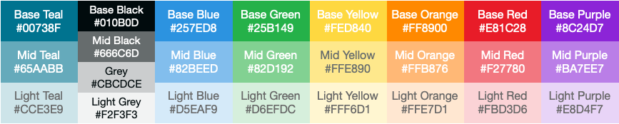
Colour is the most immediate method by which we communicate the Gydeline brand and values. To reflect our clear and simple ethos we have a reduced, simple colour palette.
The predominance of teals, greys and monotones in our palette reflects the balanced, calm impression we want to portray. Whilst secondary and supporting colours are available the emphasis should always be towards the clear grey/teal theme.
Primary Brand Colours
At the core of the palette sits Gydeline teal. This is the foundation of the scheme. Most text and headings will use these colours.
In addition white and tints form part of the core scheme. White will give space and contrast whilst tints can provide emphasis.
Teal
#00738F
Black
#010B0D
Mid Black
#666C6D
Grey
#CBCDCE
Light Grey
#F2F3F3
White
#FFFFFF
Secondary/Accent Colours
Due to the complexity of many of the charts, diagrams, illustrations and icons that are part of the Gydeline service it is sometimes necessary to use additional colours to display a more granular level of detail than is available with the core colours. Where these colours are used it should always be in the overall context of the grey/mono scheme.
Blue
#257ED8
Green
#26B149
Yellow
#FED840
Orange
#FF8900
Red
#E81C28
Purple
#8C24D7
Text Colours
Gydeline Black – Used for headings
Gydeline Mid Black – Used for sub-headings and text
Gydeline Teal – Used for smaller headings, diagrams, keys and footnotes
Tints
Usage
At the core of the palette sit teal and grey. These are the foundation of the scheme. Most text and headings will use these colours.
In addition white and tints form part of the core scheme. White will give space and contrast whilst tints can provide emphasis.